A chat widget that looks bolted on gets ignored. One that looks like part of your site gets used. The Appearance tab is where you make that happen — colour, logo, icon, and where the button sits on desktop and mobile.
None of it requires touching your website code. Change it in Holp and it updates everywhere the widget appears.
Where to find it
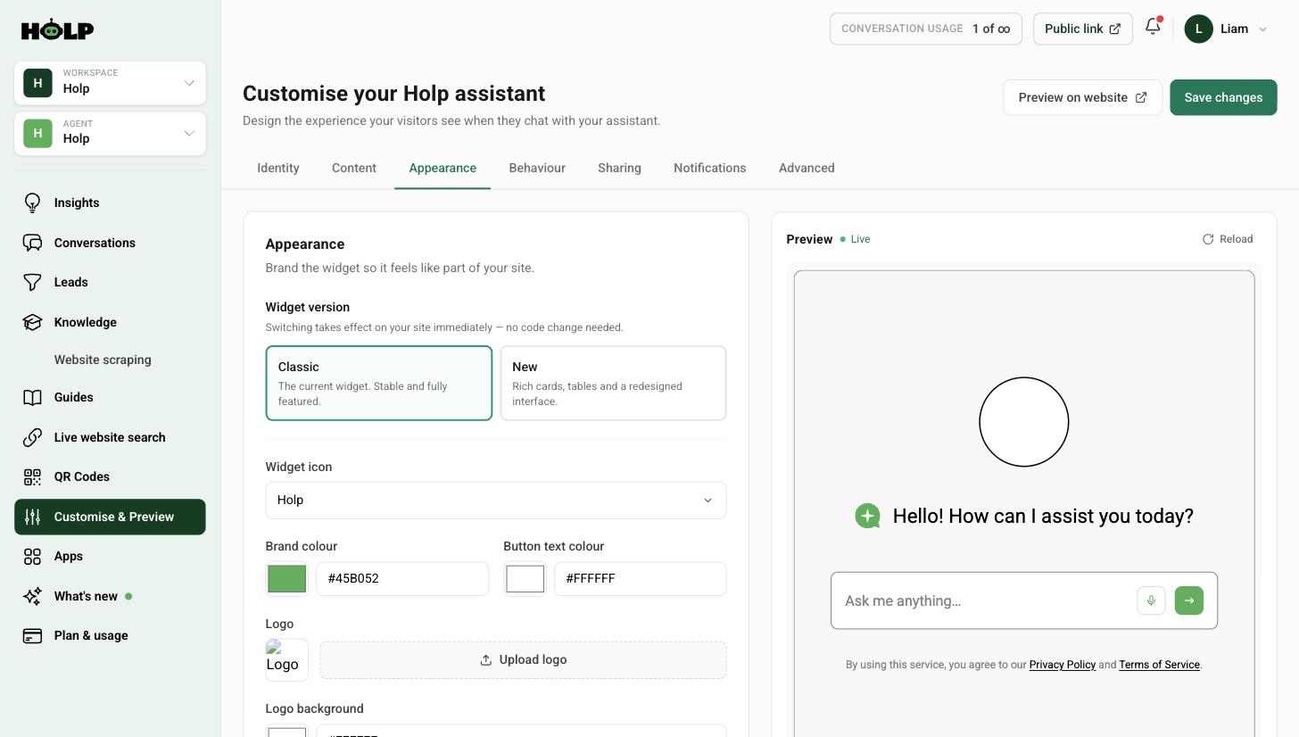
Go to Customise & Preview and open the Appearance tab. The live preview on the right updates as you go.
Widget version: Classic or New
Two versions are available and switching takes effect on your site immediately, with no code change.
- Classic — the established widget. Stable and fully featured.
- New — a redesigned interface with rich cards and tables.
The New widget is worth a look if your answers involve lists, comparisons or anything that benefits from structure. A few settings are marked as new-widget-only, including the assistant description and the choice of AI model.
Switch, test it properly on your own site, and switch back if it is not right. Nothing is lost either way.
Widget icon
The icon shown in the launcher and beside answers. The built-in options are Holp, Robot, Search, Support and Chat.
A quick rule: Search suits sites where people arrive hunting for information, Support and Chat suit sites where people arrive with a problem, and Robot is honest about what it is. Pick the one that matches why people would click.
Brand colour and button text colour
Two colours: the brand colour fills the launcher and buttons, and the button text colour is what sits on top of it.
Get these from your brand guidelines if you have them, or pick the colour off your website’s primary button. The important part is contrast — a strong contrast between the two keeps the button readable for everyone, including people with low vision. A mid-tone brand colour with white text is usually a safe pairing; a pale colour with white text is not.
One practical note: your launcher does not have to match your main call to action. If your Book Now button and your chat button are the same colour and sit near each other, people will misclick. A little difference helps.
Logo and logo background
Upload your logo and it appears in the widget. There is also a logo background setting, which matters more than it sounds: if your logo has a transparent background and your widget is a dark colour, a transparent logo can vanish. Set the background to match your brand or leave it white and the logo stays visible.
Use a square or near-square version of your logo if you have one. Wide horizontal lockups get squeezed into a small space and become unreadable.
Launcher position and shape
You can set the desktop position and the mobile position separately, and choose between a circle and a tray shape.
Mobile is where this earns its keep. Bottom-right on a phone is prime real estate, and it is often already occupied — a sticky basket button, a cookie banner, a back-to-top arrow. Load your own site on a real phone and look. If there is a collision, move the mobile position.
If your site sets the position with Holp’s JavaScript API, that overrides both of these settings.
Test on a real site, not just the preview
The preview shows you the widget on a clean background. Your website is not a clean background. Use Preview on website to see it in place, and check:
- Does the launcher stand out against your actual page, including on pages with photography behind it?
- Does it clash with anything sticky at the bottom of the screen?
- Is the logo legible at small size?
- Does it still look right on a phone?
Common mistakes
- Pale brand colour with white text. Looks fine on your large monitor, unreadable for a lot of people. Check the contrast.
- A transparent logo on a dark widget. Set the logo background.
- Never checking mobile. Most of your visitors are on a phone and the collisions only happen there.
- Matching your primary CTA exactly. Creates misclicks.
- Switching widget version and not testing. It changes on your live site immediately.
A worked example: a heritage brand and a start-up
Two organisations, opposite decisions, both right.
A 150-year-old auction house uses its deep navy as the brand colour with white text, the Support icon, a circle launcher bottom-right, and its crest as the logo on a white logo background so it does not disappear against the navy. Restrained, and it reads as part of a serious website.
A consumer app start-up uses a bright coral with near-black text for contrast, the Chat icon, a tray launcher, and no logo at all — the icon does the work. It is loud on purpose, because on their site the widget competes with a lot of colour.
The common thread is not the choices, it is that both checked the contrast between the launcher colour and the text on it, and both looked at the result on a phone before signing it off.
A quick way to check contrast
You do not need a tool for the rough version. Squint at the launcher, or look at it on your phone in daylight. If the text on the button is hard to read, it is failing for a lot of people who are not squinting.
The reliable version: a mid to dark brand colour with white text almost always passes. A pale or pastel brand colour with white text almost never does — use a darker shade of your brand colour for the widget, or switch the button text to near-black. Nobody will notice the shade is slightly darker than your brand guidelines; everybody notices a button they cannot read.
The logo trap
Two things go wrong with logos, and both are avoidable.
Transparent backgrounds. A logo designed for white paper, dropped onto a dark widget, becomes invisible. That is what the logo background setting is for — set it to white or a brand colour and the logo has something to sit on.
Wide lockups. A long horizontal logo with a strapline gets scaled down to fit a small square space, and the strapline becomes an illegible grey smudge. Use the compact version of your logo if you have one, or the mark on its own.
Deciding on the widget version
If you are unsure whether to move to the New widget, ask what your answers look like. Content with structure — comparisons, lists of options, prices by category, opening times by day — benefits from rich cards and tables. Content that is mostly short prose answers gains less.
Switch it on, ask five real questions on your own site, and look at whether the answers read better. Switching back costs nothing and loses nothing.
A sign-off checklist
- Launcher legible against your actual pages, including any with photography
- Checked on a real phone, not a narrow browser window
- No collision with cookie banners, sticky bars or floating buttons
- Logo visible against the widget background
- Launcher distinct enough from your primary call to action to avoid misclicks
- Widget version tested with real questions
Frequently asked questions
Do I need to update my website code after changing the appearance?
No. The snippet on your site points at your assistant, so colours, logo, icon, position and even the widget version update automatically once you save.
What is the difference between the Classic and New widget?
Classic is the established, fully featured version. New has a redesigned interface with rich cards and tables, and supports a few extra settings such as the assistant description and choosing the AI model.
Can I use a different position on mobile?
Yes. Desktop and mobile positions are set separately, and mobile applies below 768 pixels wide.
Why has my logo disappeared?
Most likely it has a transparent background and is blending into the widget. Set the logo background colour to something that contrasts.
What colour should I use?
Your brand colour, as long as it has strong contrast against your button text colour. If your brand colour is very pale, use a darker shade of it for the widget.
Can I upload a custom icon?
You can upload your logo, which appears in the widget. The launcher icon itself is chosen from the built-in set.
Will changing the widget version lose my settings or conversations?
No. Your knowledge, settings and conversation history are unaffected. Only the presentation changes.
Where to go next
- How to set your assistant’s name, tone and greeting
- How to add a welcome bubble and suggested prompts
- How to add the Holp chat widget to your website
More from Holp
- How to add live chat to a website — the install on every platform, and the decisions to make first
- AI chatbot for WordPress — plugin or snippet, and what it can actually read
- All resources — tools, comparisons and platform guides in one place